Bike Sharing Data for Planning
📬 Get the future posts directly in your inbox:
[Version en español]
At the beginning of the year Guadalajara’s bike share system saw an increase in users per day, during the first days of January more than 600 new users join the program, this in part due to the shortage of gasoline in gasoline.
To increase the subscriptions of a public bike system is always good news, it means that more people are willing to move around the city by bike. And with this a question come into mind, how are people moving around? Where are they going? and more important, how can we see those trips to plan new infrastructure to keep promoting the use of the bicycle as a mobility option?
Data
With these questions in mind, I started to play around with some data from MiBici. The specific dataset is from January 2019 and contains 405,169 trips, the origin-destination, time when the bike was taken and returned. This allows me to build a network, using the stations as nodes and the trips as links. I aggregated the number of trips between stations as the weight of the link.
Results
The first result is the network bellow, where we can see the evolution of the network by day, the size of the stations represent the number of originated trips, while the color and thickness of the links represent the trips made between two stations.
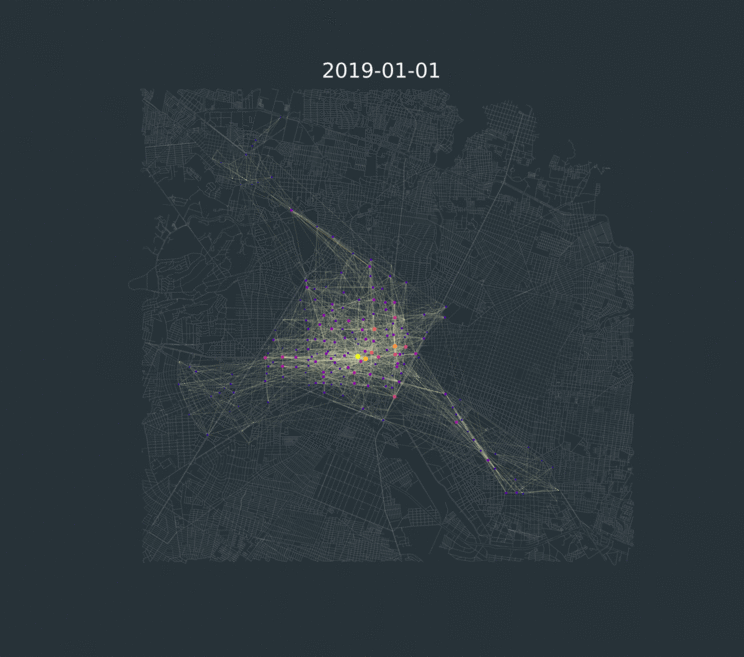
The first thing we can notice is that the central part of the city is the most active one, this makes sense due to the abundance of stations in that particular area of the city. We can also notice the centralized nature of the trips, from the three other zones the majority of the trips goes to or from the center, while there are just a few trips made between these peripheric zones.
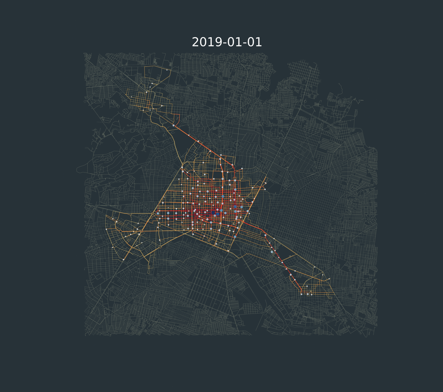
Now that we know how people are moving in the system, the next question is can we have a better resolution of the trips? We know people are moving from one station to other, but we don’t know which streets they are using. To overcome this problem I downloaded Guadalajara’s streets using OSMnx, and look for the closest intersection for each bike station.
With the streets data and stations locations, I used Dijikstra’s algorithm to find the shortest path for all the trips that were made between stations. I did this following the idea that the bike users where going to use the shortest path to go form their origin to their destinations. Although this may not be true for all cases, it is a useful proxy to identify the theoretically most used streets. The next animation shows the commute activity by day adjusted to the shortest paths, the color represent the number of users, and the color and size of the stations are proportional to the number of originated trips.
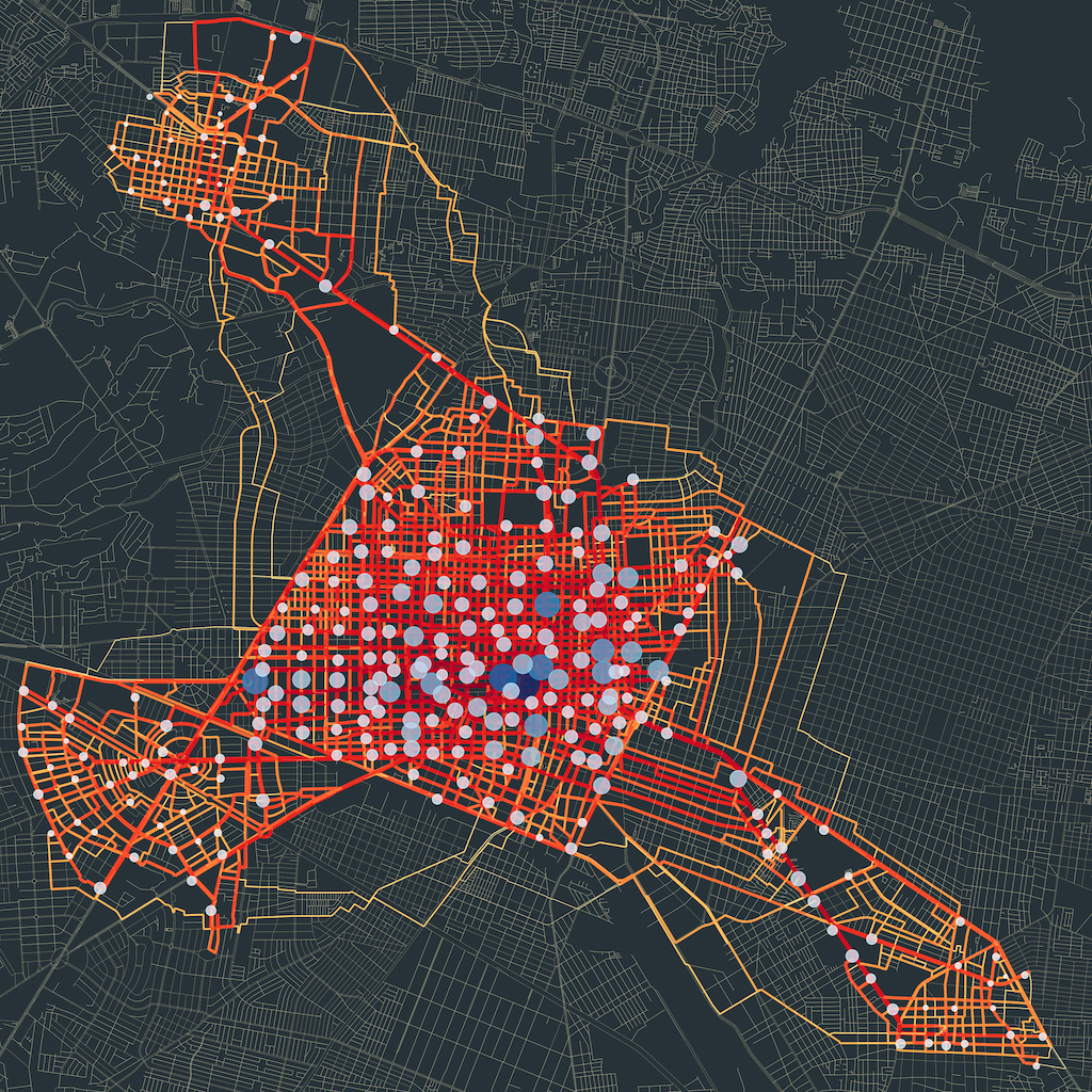
When we aggregate all the day trips we obtain a clear image of the most used streets for biking. The resulting network could be used as a validation point for investing in bicycle infrastructure, we see some of the main avenues highlighted in red, indicating their importance in the biking system.
The code for the analysis and the plots is available in this GitHub repo.
📬 Get the blog posts directly in your inbox:
💬 Join the conversation:
Keep to conversation with a comment or reach out in my social networks.