Connected or fragmented: Analyzing the State of Bicycle Infrastructure in Cities With Python
📬 Get the future posts directly in your inbox:
How often does it happen that while driving a car the street disappear or gets merged into a sidewalk? It really does not happen, right? On the other hand, how often does it happens while riding a bike, that the bike lane ends and gets merged into a street or into a sidewalk? In my experience more often than it should be. Although it is possible to ride a bicycle in a street, and share the space with the cars, it is not optimal. Unless we are talking about a fietsstraat, but in that case it is a bicycle infrastructure.
A #fietsstraat (cycle street) is designed as a bicycle route, on which cars are also allowed. As the bicycle is the preferred mode of transport, cars are guests on these cycle streets. Shown is the Maliesingel in @Utrecht. Video by @BicycleDutch , 2018 https://t.co/OpB988F5Yq pic.twitter.com/E3M4u0ZXhg
— Dutch Cycling Embassy (@Cycling_Embassy) February 5, 2019
Using open software and data, it is possible to measure the how connected or fragmented is the dedicated cycling infrastructure. With a few lines of code one can download the mobility infrastructure network of a city, and keep only the designated bicycle infrastructure. The first step is to import and configure OSMnx, and NetworkX.
import networkx as nx
import osmnx as ox

ox.config(use_cache=True,
          useful_tags_way = ox.settings.useful_tags_way + ["bicycle"])
Then, download the graph network for the city. The bellow function downloads all the network and filters out the non bicycle infrastructure:
def bike_network(city: str) -> nx.Graph:
    G = ox.graph_from_place(
        city, network_type="all", simplify=False, which_result=1)
    non_cycleways = [(u, v, k) for u, v, k, d in G.edges(keys=True, data=True)
                     if not ('cycleway' in d or "bicyle" in d or "cycle lane" in d or "bike path" in d or d['highway'] == 'cycleway')]
    G.remove_edges_from(non_cycleways)
    G = ox.simplify_graph(G)
    return ox.project_graph(G)
Finally, to find how completed or fragmented the bicycle infrastructure might be, one can count the number of components in the network, it can be done with some list comprehension:
bike_components = len([c for c in nx.connected_components(nx.to_undirected(G_bike))])
print(f"The city of {city}, has {bike_components} different 🚲 bicycle components")
When applying the previous code to different cities we can understand how fragmented their cycling infrastructure is. Take for example the case of Amsterdam, one of the most cycling friendly cities in the world, the data shows that it has 282 different components, while for London, the data shows around 3,000 different components, highly fragmented city.
In the paper “Data-driven strategies for optimal bicycle network growth” [1] my coauthors and I followed a similar approach to compare different cities, and it turned out that most of the bicycle infrastructure in the 14 analyzed cities is fragmented.
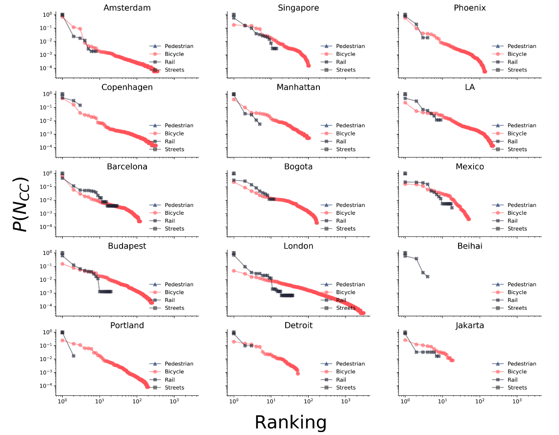 The connected component size distribution $[P(Ncc)]$ for fourteen cities and four different transportation options is well connected except in the bicycle layer. London has the most fragmented bicycle infrastructure layer, with more than 3000 component
Certainly, the fragmentation of the bicycle infrastructure puts some extra burden to the promotion of biking as a mobility option, specially in cities that have most of their infrastructure designed for a car-centric mobility.
Finally, let’s compare the cycling infrastructure vs the car one, and plot both of them. First, we need to download the driving infrastructure:
G_drive = ox.graph_from_place(
        city, network_type="drive", simplify=True, which_result=1)
G_drive = ox.utils_graph.remove_isolated_nodes(G_drive)
G_drive = ox.project_graph(G_drive)
drive_components = len([c for c in nx.connected_components(nx.to_undirected(G_drive))])
print(f"The city of {city}, has {drive_components} different 🚙 drivable components")
And then we can plot both of the networks into one combined figure:
bike_edges = ox.graph_to_gdfs(G_bike, nodes=False)
drive_edges = ox.graph_to_gdfs(G_drive, nodes=False)

fig, ax = plt.subplots(1,1,figsize=(16,9), facecolor="#F8F8FF")
ax.set_facecolor("#F8F8FF")
drive_edges.plot(ax=ax, linewidth=0.25, color="#003366", zorder=0, alpha=1)
bike_edges.plot(ax=ax, linewidth=1, color="#FF69B4", zorder=1)

title = ax.text(0.5, 0.0, "Amsterdam", transform=ax.transAxes, fontsize=40, color="#4B0082", ha="center", va="center")
subtitle = ax.text(0.5, -0.07, "street & bike network", transform=ax.transAxes, fontsize=21, color="#003366", ha="center", va="center")

ax.axis("off");
The result is the bellow plot:
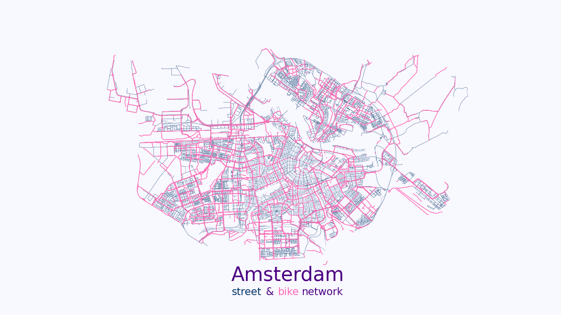 The plot shows the driving and bicycle infrastructure networks in Amsterdam
Understanding how fragmented or connected the bicycle infrastructure is, can help urban planners to identify possible areas of improvement, intersections where conflict between transportation modes might be happening, and overall improve the security, accessibility, and comfort of biking in the city.
A Jupyter Notebook with the code used for this post, is available in the GitHub repo of my website. Check it out!
- Natera Orozco Luis Guillermo, Battiston Federico, Iñiguez Gerardo and Szell Michael 2020 Data-driven strategies for optimal bicycle network growth R. Soc. open sci. 7:201130. 201130 http://doi.org/10.1098/rsos.201130
📬 Get the blog posts directly in your inbox:
💬 Join the conversation:
Keep to conversation with a comment or reach out in my social networks.